
while last week was about going over the cliff, the conversation switched this week to hitting the ceiling…while the fiscal metaphors may not seem sequentially appropriate, we are, nonetheless, out of the fiscal frying pan and into the fire...as we noted last week, the fiscal cliff deal left two big elephants in the way of a return to normal government functioning; the debt ceiling, which was breached on December 31, and the sequestered spending cuts that were imposed by the Budget Control Act, which were delayed till March in the deal making of last week; while the sequester seemed to remain on the back burner this week, the Republicans appear to want big cuts in entitlement programs, including Medicare and Social Security, as a condition for raising the borrowing limit; on the other hand, Obama has drawn a line in the sand and says he wont compromise over ‘”whether or not Congress should pay the tab for a bill they’ve already racked up” …with gridlock apparently guaranteed, an old idea that has been banging around the blogosphere for a few years resurfaced and went viral this week, driven by early support from Paul Krugman, lead Bloomberg economics blogger Josh Barro, and Business Insider editor Joe Weisenthal; the basic concept is that the debt ceiling could be circumvented if the Treasury would mint a trillion dollar coin, deposit that coin in it’s account at the Fed, and use the electronic proceeds to continue paying its bills…another variation of the same, proposed by steve randy waldman, would be to mint a million million dollar coins and use those to pay bills directly…and Joe Firestone and economists at the University of Missouri-Kansas City have been circulating a petition to mint a 60 trillion dollar coin and put the entire question of cutting spending during a recession to rest…while these are all gimmicks to be sure, they do expose the ruse perpetrated by the deficit scolds that government spending in a fiat currency is somehow limited by the amount of taxes it collects or the amount of debt outstanding…
 the most important economic release of the week was from the Commerce Dept, on our November Trade Deficit in Goods and Services (pdf); it was much worse than expected, as our November exports of $182.6 billion and imports of $231.3 billion resulted in a seasonally adjusted trade deficit of $48.7 billion, up 16% from the $42.1 billion trade deficit in October; the goods deficit increased $6.6 billion from October to $65.7 billion, and the services surplus was virtually unchanged from October at $17.0 billion…goods exports increased $1.6 billion to $129.3 billion while goods imports increased $8.2 billion to $195.0 billion, and services exports increased $0.1 billion to $53.2 billion while imports of services increased $0.2 billion to $36.3 billion..since exports minus imports is a major component of GDP, this led to immediate downward revisions of analysts forecasts for 4th quarter GDP; J.P.Morgan cut their estimate for 4th quarter GDP growth to an annualized 0.8% from their earlier forecast of 1.5%; Barclays analysts cut their estimate to 1.3% from 2.0%, as did Nomura, and Goldman Sachs cut theirs from 1.8% to 1.3%; while imports of petroleum products fell by $870 million as oil averaged $97.45 per barrel in November, down from the $99.75 price in October, our imports of consumer goods rose by $4.6 billion, imports of automotive products rose $1.5 billion); and imports of industrial supplies rose $1.3 billion over october…our exports saw increases in capital goods of $0.9 billion, automotive products of $0.7 billion, and industrial supplies of $0.6 billion, while exports of foods, feeds, and beverages decreased $0.4 billion on a seasonally adjusted basis; the trade balance figures with other countries and regions, however, are not seasonally adjusted; our largest November deficits were with with China $29.0 billion (down from the record $29.5 billion in October), the European Union $12.2 billion (up from $10.6 billion), OPEC $6.6 billion (down from $8.6 billion), Germany $6.2 billion (up from $5.4 billion), Japan $6.2 billion (down from $7.0 billion), Mexico $4.9 billion (up from $4.4 billion), Canada $3.0 billion (up from $1.7 billion), Ireland $2.3 billion (up from $1.8billion), Venezuela $2.0 billion (up from $1.8 billion) , and Korea $1.8 billion (up from $1.6 billion) ; small trade surpluses were recorded with Hong Kong $3.0 billion (up from $1.9 billion for October), Australia $1.8 billion (unchanged), Singapore $1.1 billion ($0.5 billion), and Egypt $0.2 (unchanged)…the calculated risk chart we have included here shows the overall trade deficit in blue (negative from the top of the chart), the petroleum deficit in black, and the trade deficit without oil in red….note that even though US oil imports have fallen to a 25 year low, it has not substantially changed our oil trade deficit because average imported oil prices have been trending higher…
another monthly report that we’ve been following that was released this week was the Fed’s G-19 on consumer credit for November; overall, consumer credit rose by a seasonally adjusted $16.1 billion from October to November, or at an annual rate of 7.0%; revolving credit, or borrowing in the manner of credit cards, increased by $800 million, a 1.1% annual rate, while non-revolving credit, or borrowing for such as cars, yachts and college education but not loans for real estate, increased $15.2 billion from October, rising at an annual rate of 9.6%…to determine the breakdown on the increase in government student loans, we check the 3rd table in the G-19, with the heading “Consumer Credit Outstanding, and the subheading “Major types of credit, by holder”; there we see loans outstanding issued by the federal government increased from $516.4 billion in October to $521.3 billion in November, an increase of $4.9 billion, which is not seasonally adjusted; since the total unadjusted non-revolving credit increased from $1909.6 billion to $1917.5 billion, or $7.9 billion, it’s apparent that $3.0 billion of the November increase in non-revolving credit was for auto loans and such, which is more than we’ve been seeing recent months, so it may be Sandy related…the chart we have created here using FRED includes each of the major components of the G-19, plus the student loans owned by the Federal government; the blue line tracks total consumer credit outstanding since 1980; the red line tracks total non-revolving credit outstanding, while the orange line tracks revolving, or credit card debt outstanding, which you can see has been declining since the recession (grey bar); lastly, the green line tracks the student loans owed to the Federal government, which have quintupled since the beginning of 2009…since we know from the Fed’s quarterly report on Household Debt that outstanding student loans have exceeded credit card debt, it’s evident that the totals in this report for non revolving credit from financial companies and depository institutions (the red line) would also include a large portion of student loans…
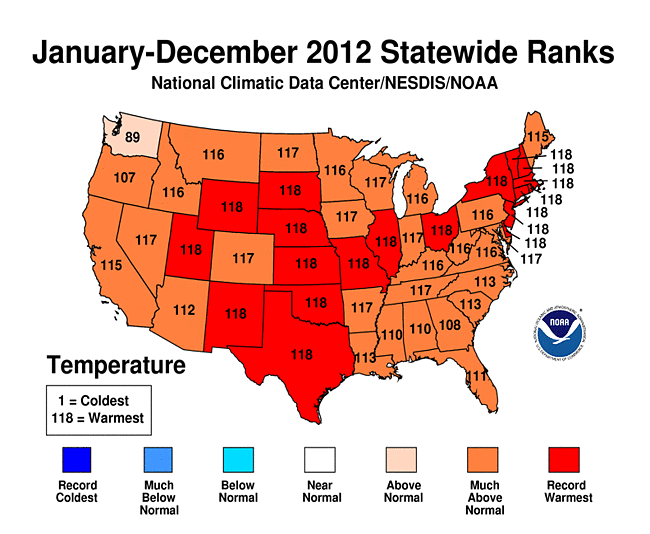
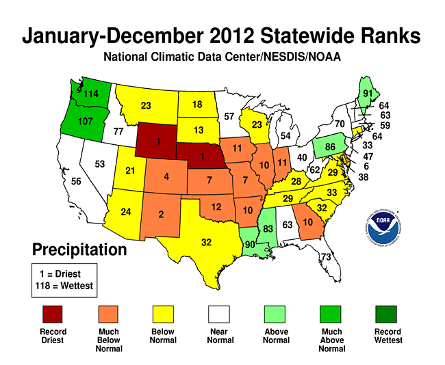
finally, we would be remiss if we didnt at least mention that the official totals on 2012’s weather have been released by NOAA; for most of you, it probably goes without saying that 2012 was the warmest year on record in the lower 48 states; no less than 19 states experienced their warmest year ever, and all but Washington saw one of the twelve warmest in the 118 years of record keeping…it started with the fourth warmest winter (December 2011-February 2012), which was followed by the warmest spring on record, which surpassed the previous record by an unheard of 2.0°F, and was untempered by the 2nd hottest summer on record, highlighted by a july that recorded an average temperature of 76.9°F, 3.6°F above average, making it the hottest month ever observed for the contiguous United States…and although the last four months of the year were not record setting, they were above normal enough for 2012 to go into the record books 1.0°F above the previous record year 1998 and 3.2°F above the 20th century average…34,008 daily high records were set at weather stations across the country, compared with only 6,664 record lows; 362 all time record high temperatures were also, but there were no all time record lows…the nationally average for rainfall was also subnormal at 26.57 inches, 2.57 inches below average, making it the 15th driest year on record for the nation as a whole; Wyoming and Nebraska had their driest year on record, and eight other states, most in the grain belt, had one of their top-ten driest years; 61.8% of the area of the contiguous U.S. experienced moderate-to-exceptional drought during July, which was the largest drought footprint since the Dust Bowl year of 1939…and that great plains drought persists today; on Wednesday, the USDA declared much of the central and southern Wheat Belt a natural disaster area due to the continuing drought that put this year’s winter wheat in jeopardy…and the worst drought since the 1930s may yet close a 200-mile stretch of the Mississippi River between St. Louis and Cairo, affecting billions of dollars’ worth of cargo, including grain, coal and crude oil, and thousands of related jobs…we’ll include two illustrative graphics below from NOAA’s extensive collection; on the left, we have a graphic of the temperature ranking for each of the contiguous 48 states; the 19 in red saw their hottest year in the 118 year record; an additional 9 states, marked as “117”, saw their second highest temperature readings on record; in fact, only 3 states, Georgia, which saw its 11th warmest year, Oregon, whiich recorded its 12th warmest, and Washington, which saw its 30th warmest, did not have annual temperatures among the ten warmest in their recorded history…in the graph on the right, we have each of the 118 years in NOAA’s database charted as a horizontal line, with the departure from the 20th century average graphed monthly for each year (click to enlarge and see the numeric values); the five previous record high years 1998, 2006, 1934, 1999, and 1921) charted in orange, and the five coldest years (1917, 1912, 1895, 1924, and 1903) charted in blue…2012 is the dark brown upper line that, after February, never again approached the norm all year…
…..

(the above is my weekly commentary that accompanied my sunday morning links emailing, which in turn was mostly selected from my weekly blog post on the global glass onion, and also includes other links of interest…if you’d be interested in getting my weekly emailing of selected links that accompanies these commentaries, most coming from the aforementioned GGO posts, contact me…)
